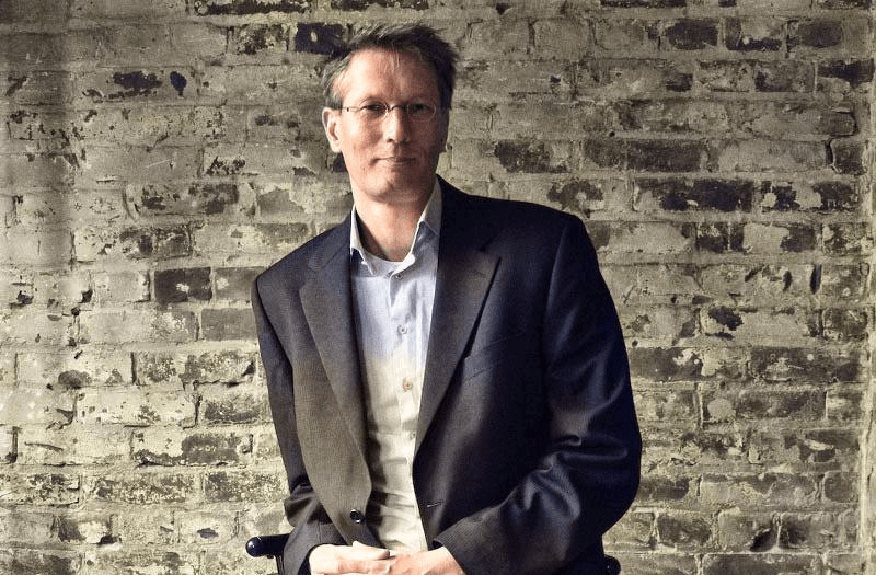
Bert
BoerlandThat is me
And i do welcome you here, beautiful wanderer.
So please do sit down and lend me your ear and I will tell you my story in the paragraphs to follow. And let’s see if we can make this a little bit about you as well, so we can start working together.
"A Business Nerd"
I call myself a Business Nerd. I have been nerding with technology ever since my first computer in 1982, a C=64.
I am online since 1989, before there was “the web” and have been making a living using the internet since 1995.
So, I am proud to call myself a ‘Business Nerd’.
This domain (boer.land) is the vanity domain of me, Bert Boerland. I like emerging technologies and have a keen eye for business opportunities. I have a vision and am opinionated. Sometimes these two converge and this is where I am at my best.
Making contact as well as sketching opportunities. For prospects, for team members.
And maybe for and with you.
I also co-founded a successful web agency creating innovative digital experiences based upon the open source project “Drupal” and sold this agency to a Canadian enterprise.
As a side project, I am currently kickstarting another company, a Computer-Generated Imagery animation studio using the open source “Blender” tool.
Lots of fun, never a dull moment.
So while you thought you were lost wandering the net, you might actually have found what you were looking for: a site about a nice chap that is always searching for ways to grow and learn by helping others.
So if you need a speaker, a coach or an investor, or just someone to talk to, you might have wandered into the right website after all.
Speaker
Coach
Investor
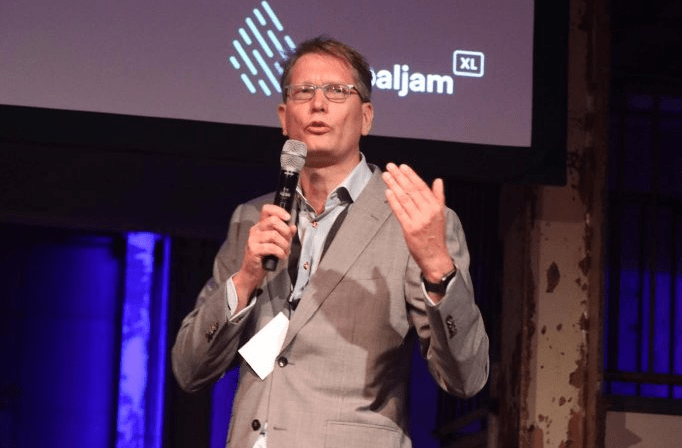
Me speaking
I have been speaking on dozens and dozens of smaller and bigger conferences and organised many of them as well. I have been speaking on DrupalCon’s, Frontend United, Drupal Jam’s, T-Dose, WordPress camp , Linux World Expo, eduvision, Mediaplaza and a guest lecturer on for example Haagsche Hoge School. Fast and sharp presentations that will still resonate after some time.
Me coaching
I am helping a start-up SaaS and a web agency to kickstart their products and services.
Co-creating the vision all the way to the finance and delivering a Go To market strategy. From spreadsheet to a future-proof yet agile business plan, I am not just here to challenge you and your ideas but really help and build upon your strenght.
Me investing
Dont take my word
Well, actually. Do take my word. But read about what others have been posting about me as well on linkedin
“Bert is great. Always willing to take my company a step further positively and with wisdom.”
“Bert is one of the most original thinkers[…] and combines thorough knowledge of the inner workings of the Web with creativity and lateral thinking.”
“Bert is an excellent speaker! He knows how to bring his message with enthousiasm, humor and great knowledge of the subject”
***blush***

How can I help you?
IN PRIVATE
Born and raised in Groningen where I studied as well. At the age of 25 moved to the “the west” of the Netherlands and ended up in the region of Haarlem. I am a proud father of two beautiful kids who at a certain age will argue who gets the boerland.com and the boerland.org or even this boer.land domain. Or maybe they wouldn’t even care about a domain name in 30 years.
IN HOBBY
The nerdism has been around me since my first Commodore 64. I was able to mix my digital hobbies with my professional live from an early age. When I was 18 years old, I wrote as a student in a national computer zine called “Amiga Magazine” back in the early nineties of the last century. I made 100 guilders per page and I couldn’t have been more proud to see my name in print in all the bookstores in the low lands.
Ever since then, I have been mixing private and business as much as I can. With my logic, doing something you are good at and get energy from, while getting paid, is the best thing. One might lose a hobby, but it sure beats losing your job.
So around 2000 I became interested in the Content Management System. The thought of publishing without the layout hardcoded to the content was interesting back then and still is the core principle of the web. I started with PHPNuke but the italian documented spaghetti code was even for a non coder like myself indigestible. I ran into drop.org, a place where some friendly people talked about the web two dot ooh and the semantic web and became active in that community. The site became an open source tool (Drupal) and I bought the domain name drupal.org and gave it to Dries. Ever since then I have been active in as many non coding ways as possible. I organised the DrupalCon Amsterdam 2005 and Barcelona 2007 as the lead and helped as a track chair in many other DrupalCon’s as well as organised the Frontend United conference in Amsterdam. I was a board member of the Drupal Association and founded the Dutch Drupal Foundation and have been a boardmember for many many years. I started the DrupalJam events (now over 500 attendees) and have been organising them for over a decade.
Other hobbies include domotica, reading non fiction books, drawing and experimenting with natural user interfaces. Recently I switched some of my spare time towards another cool European Open Source project called Blender. Though not as active in the community, I learn as much as I can about this tool. For my hobby but for sure to help people out commercially as well.
IN Business
I always envied my parents who after the war -my father was 50 when I was born- could become whatever they wanted without having a diploma. The truth is that my kids should envy my generation. My parents couldn’t become what they wanted due to social restrictions. My mother for example had to quit her job when she became pregnant.
I however have an academic degree that I never used for my profession in a narrower sense. But when I took a job I was thrown into the deep and managed a BGP network, the core of the internet without any prior knowledge of how TCP/IP worked and maintained a firewall (a complete new concept in 1995) for a big pharma while I had never seen a UNIX system.
With coaches and the right attitude I made it and worked my way up to architecture, consulting and management.
And still, I do what gives me power. Starting new companies, learning from young people, working with cool customers.
How can you help me?
(oooh, and if you are someone who needs a 3D animation, contact me as well)
They call it social
I blogged from 2000 until 2017. Though I stopped, I always kept posting my opinions and pictures at the different social media sites I use. I am Twitter since 2007 (@bertboerland) for rants and real-time help, on LinkedIn since 2004 for my business partners and for example on insta , spotify and sometimes facebook.
I don’t think there is an emerging social service that I don’t have an account on, I must have hundreds of accounts from Medium to Orkut, from Flickr to Snap and zillion of services that have sunsetted a long time ago, always with my real name as a handle; “bertboerland”. So do connect with me at your favourite medium as well.
Hope to see you on any of these media
“Velkommen til at kontakte mig”
or: Please do contact me
(and I don’t speak Danish at all…)
If you need a speaker for an event about the open web, want pro bono advise on what CMS to use, or are just interested in me,
please drop a mail at bert AT boerland DOT com.

Where
Region Haarlem,
The Netherland
(But I do like to travel)
Why
To drink coffee
(9 am – 11 am)
or a beer
(17+ pm).
To hangout, to talk, to listen, to learn, to dream, to walk, to draw, to read and to write. In that order.
Contact
Drop me a line at
bert at boerland.com
Legal
Why is there no cookie bar on this site? Because I do host my own open source analytics server (Matomo) and I do not share any of your information with a third party like Google or Facebook. If you run your own website yourself, you should consider running your own analytics service as well.
Remember, when it comes to your own users data: “Sharing is not caring”.